Selecting white paint for your space might seem like a simple task, but choosing the ideal white can transform your space completely. As an interior designer and certified color consultant, I am often asked: What is the best white paint to use for my space. A question that is often asked only after clients have been to the paint store a half a dozen times, and find themselves overwhelmed in a sea of paint swatches- paralyzed by choices, and not knowing which color to use for their space.
Here is a secret that you might not hear elsewhere, the truth is, there is no single white that works for every home. What looks gorgeous in one home, may look not so good in another. The reason is because white is a tricky color, it is highly sensitive to its environment, and you must consider influencing factors, from lighting conditions to flooring, direction of your windows, and any other colors reflecting on your white surface-but don’t be discouraged. I am here to share some of my absolute favorite white paint colors, tested and tried on some of my best renovating projects, and I know you will love these colors too.
I love using whites in my projects that feel open and airy, warm and timeless. The color needs to feel elevated and sophisticated in my opinion, and it must be the glue in the space that keeps it feeling connected and welcoming. These colors are my favorite because they are perfectly balanced and timeless, bright and airy, especially for our coastal whole home renovation projects in Southern California, which tend to be more light-filled the majority of the time throughout the year.
Here are my top three go to whites from Sherwin-Williams.
Westhighland White
SW 7566
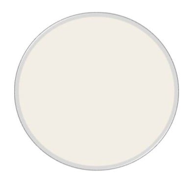 Westhighland White is one of my favorites because it is a beautifully balanced warm white- feels both elegant and inviting without appearing overly harsh. This off-white creates spaces that feel fresh, comfortable, and timeless while introducing just a touch of warmth.
This shade works especially well in areas where you want to establish a welcoming atmosphere, such as foyers, living rooms, and bedrooms. It brings a sense of brightness to a space while still maintaining a cozy and approachable feel.
Westhighland White is also an excellent choice for homes with abundant natural light, where its soft warmth helps create interiors that feel effortless and refined. I’ve found it pairs beautifully with wood tones and natural textures, making it a wonderful option for layered, organic interiors.
Unlike many traditional off-whites, it delivers warmth without the noticeable yellow undertones often associated with classic creamy whites, allowing it to remain soft, balanced, and sophisticated.
Greek Villa
SW 7551
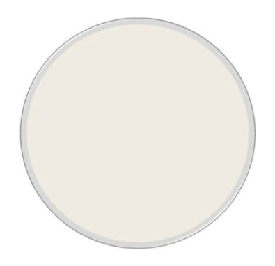 Greek Villa makes it into my favorites list because it is bright and creamy white that feels like a kiss of sunshine. It is fresh, with a classic vibe. It is airy, and light, without the paper white look. This color looks beautiful in whole home projects, and open concept spaces where you want to add a little bit of more saturation, while maintaining a fresh and bright backdrop.
I love this color because it is uplifting, soft, creamy, due to it’s yellow undertones, but it remains light and clean. It reminds me of a yummy bar of butter! It’s a great color for bathrooms, kitchens, great rooms, or any space you want to add some cheerful warmth, while maintaining your space looking clean, open and inviting.
This is more of a classic neutral, and complements best with spaces with warm finishes, and surroundings that lean more traditional or transitional.
Sanctuary
SW 9583
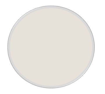 Sanctuary is a beautiful modern, off-white color, with a complex personality. It holds depth mostly derived by hints of gray undertones, which make it more modern and sophisticated than Westhighland White and Greek Villa. It is a serene, soft and sophisticated color, easily associated with quiet luxury.
This color is not creamy, and it is not gray- it is a perfect balance of a warm beige and a soft greige. The warm beige maintains a calming and airy appeal, while the warm beige adds dimension and depth to any environment.
Sanctuary is a beautiful color for coastal and modern spaces, or any environment that wants to add effortless sophistication and luxury, yet serene and subtle elegance.
Designer Tip: Always Test Your Whites
Paint color, especially white, changes dramatically depending on light sources. Natural light, artificial lighting, and surrounding surfaces and materials.
This is why I recommend testing samples before committing to a color. Trust me, your painter will appreciate you for this.
Final Thoughts
The right white paint should feel effortless, warm, and harmonious with your home. These three shades are some of my favorites because they consistently create spaces that feel bright, timeless, and beautifully balanced.
If you’re feeling overwhelmed choosing the perfect paint color, a professional consultation can make the process easy and enjoyable.
At House & Harmony Interior Design Studio, in San Diego, California, we specialize in helping homeowners select colors that elevate their homes and reflect their personal style.